the interface of software DVD players
Preamble
As computers have become more and more powerful, software designers seem to have wondered how to waste CPU cycles. So they invented themes, skins, and overconfigurable GUIs. And end users seem to actually love this !
But quite often, a real lack of functionalities hides behind the graphical side of the software. My personal opinion is that DVD players suffer from this situation : most of them try to resemble a real device, with round buttons, LCD displays and blinking LEDs.
This document was at first written to express my rant against DVD players designers, but since I have to develop a similar GUI myself it might actually evolve into something more constructive.
Classic Windows players
![]()
DVD Player for Win98
This user interface is quite simple and easy to use. It is the only one I know which almost follows the Windows GUI standard. I like the big play button, too. Perhaps a menu bar could have been added to access advanced features.
Definitely the most usable player interface.
![]()
Cinemaster 99
This one is really ugly, so one could expect it to be at least useable. Unfortunately, many icons are absolutely impossible to understand : there are five different left-arrow combinations ! And the close button is on the top left, while every other Windows program has it on the top right.
A good point however for the buttons color scheme, which leaves no ambiguity about whether a button is active or not. But note also the painfully readable red-on-black LED display.
Some ugly players
![]()
DVD Express
This player is universally known to suck. Almost no configuration options are accessible through its interface. I really wonder why they had to create their own graphics to create something as dull as this.
Although few options are accessible through the interface, the buttons are quite easy to understand.
![]()
Xing DVD Player
I find this one absolutely hideous, the buttons are unreadable. It's a pity they didn't stick to the Windows API to build this interface, and did something actually about as dull. The sliders are very confusing on this one, too.
The plethora of themeable, skin-aware, real world metaphoric players
![]()
ATi DVD Player
This is a frontend for the Cinemaster decoder.
Despite some useless parts in the design, this one is quite nice to use. However, one can wonder about the big red pad at the bottom left ( you have to know that some arrows will appear later on it - this example illustrates that a control has to be visible, even when disabled ), or complain about the dark-blue-on-black slider at the bottom.
Also, there is no way to access the Cinemaster driver settings from the panel, the button colors lack a lot of contrast, and there are no navigation indications ( time, chapter, aso. ).
WinDVD
This one has many common problems to DVD players, such as the absolutely useless numeric keypad and the big, useless DVD logo. I also find the global interface confusing due to the number of accessible controls. And the close button isn't at the right place.
You may think this one respects the Windows GUI or color standards, but actually the grey color is hardcoded, so if you decide to use another color for the Windows general look, everything will look rather ugly.
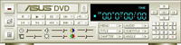
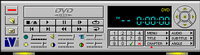
Asus WinDVD
According to 7th Zone, this player is supposed to work only with new AsusTek products.
The main problems I see with this interface are :
However, a good point is the quite readable LED display.
![]()
WinDVD 2000
This interface is quite simple and rather good looking. But many pixels are wasted just to make it good looking.
A good point for the highly contrasted LCD, as well as the correctly placed close button. However, the top ruler is quite confusing, and the two icons at the right makes wondering wheter they are buttons or not. Some people also complain because there is no way to switch to full screen mode in one click from the interface.
![]()
PowerDVD
One of the most widely used players. The design is very nice, it really looks like a real device. The interface even supports skins ! ( which I actually regard as a bad thing )
I see several problems with this interface :
![]()
VaroDVD
A quite nice looking interface, wich supports skins, too. Unfortunately the color gradient is useless and confusing, and the LED display is too rich to be really understandable. And why on Earth did they put some buttons on the left and some on the right ? It's a complete waste of mouse usage.
Some Unix players
DVD support for Unix is quite recent, so most of them should not be affected by the skin syndrom. However, features are lacking, too.
![]()
Open Media System
![]()
Open Media System
This is a Linux player still under heavy development. The GUI is still being worked on, and this is only a test skin. I put it there anyway because it could have been a finished project.
The design is very nice, although the bottom bar makes me feel I may miss the button I want to reach. The bottom left icons are pretty unreadable, you have to first learn what they do and then you click on them by remembering their position, not their label. Also, the close button should definitely be at the top right.
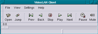
VideoLAN Client
This is the interface for a Unix player using the Gnome libraries. I'm designing this one, but I think it sucks for the moment, too.
One thing it has over the others is the visible menu bar and the text under the buttons, which often helps quickly finding a command. Another advantage is that it respects the Gnome application standards as well as the window manager, and does not try to take over the user's settings.
The main problem might be the lack of directly accessible features due to the room the buttons already occupy.
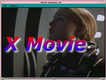
X Movie
This is the third Linux player and I don't think it's finished yet. The GUI is integrated into the display window, which isn't necessarily a bad thing. But to me, putting the commands at the bottom and the menu at the top was an error. And putting the play button at the left and the navigation buttons at the right was even worse !
Common problems
The VCR metaphor : (to do)
The chocolate metaphor : (to do)
Related links
Here are some links related to this topic :